Iceberg Branding Campaign
The concept image
Explanation
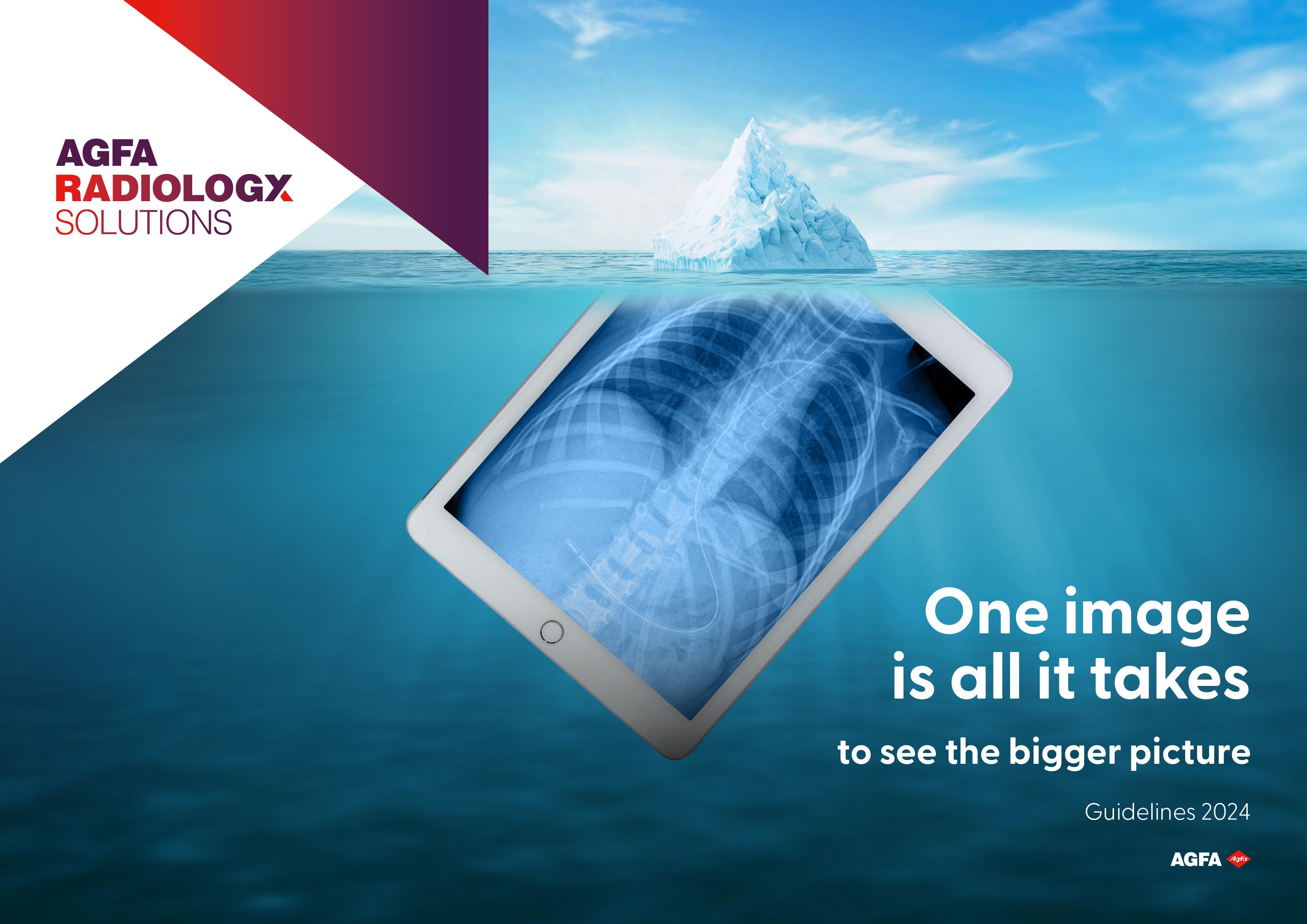
In the field of radiology solutions, the concept image of an iPad displaying an X-ray transitioning into the peak of an iceberg holds a profound message.
At first glance, the image presents a familiar sight: an X-ray displayed on a digital device. Yet, as the X-ray seamlessly merges into the pinnacle of an iceberg, the metaphor unfolds. Just as an iceberg reveals only its tip above the surface, traditional imaging techniques often provide only a fraction of the complete diagnostic picture. However, with cutting-edge radiology solutions,
the entirety of the underlying pathology becomes visible, akin to uncovering the submerged mass of the iceberg.
Use of the image
The captivating imagery serves as a powerful symbol within the realm of Agfa Radiology Solutions. Its message of comprehensive insight resonates deeply within the context of innovative medical diagnostics. However, it’s imperative to underscore that this imagery is exclusively reserved for Agfa Radiology Solutions.
The importance of white space
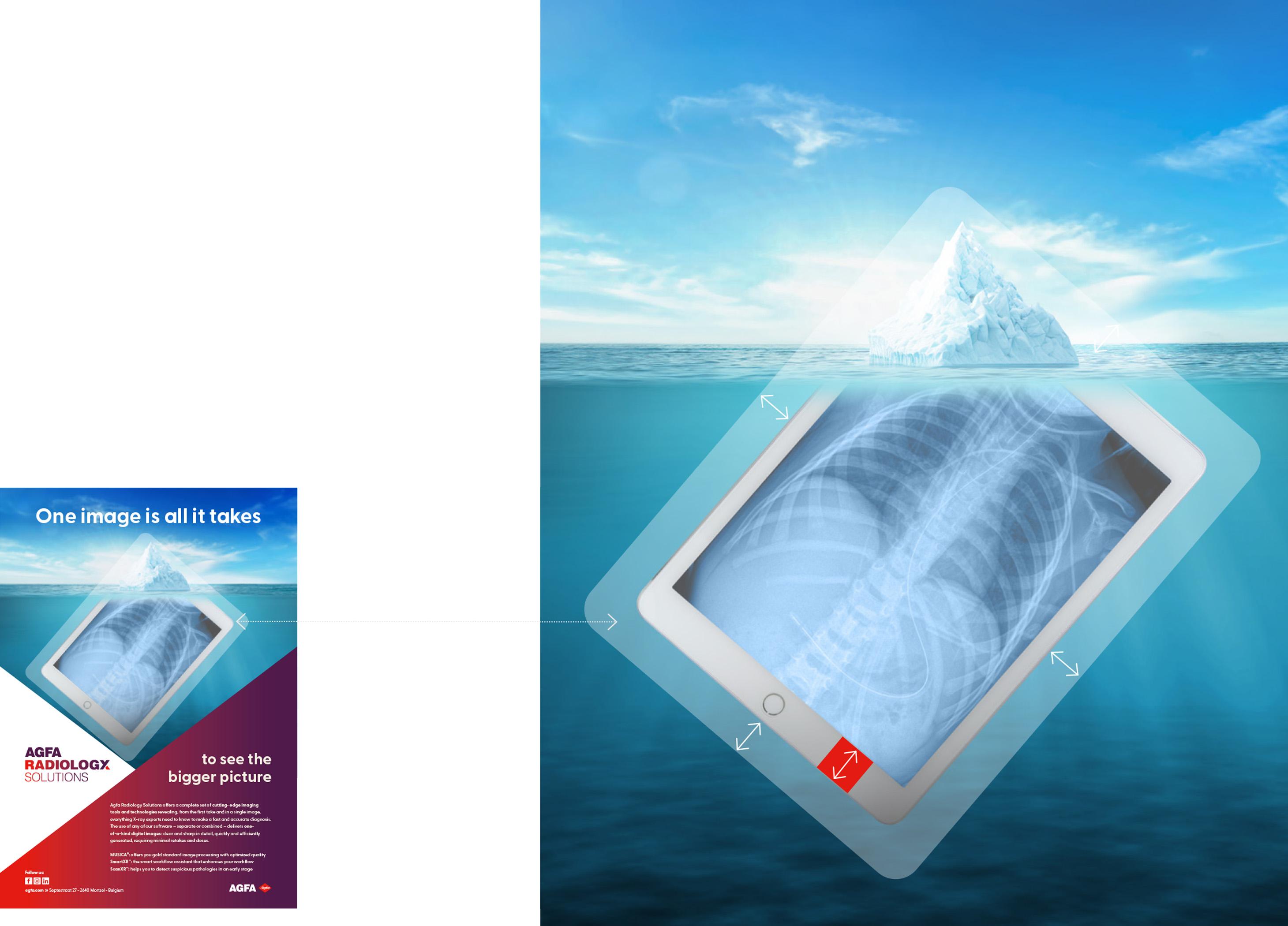
It is crucial to maintain the correct amount of white space around the iPad, with a minimum height equal to the frame of the device. Within this designated area, no graphical or text elements should be placed.
The white space adds a sense of balance and harmony to the overall composition and it serves as a frame of reference for consistency and uniformity across various applications.
The concept image as a frame

The frame of the concept image can function as a tool to enhance additional content. Serving as a supportive structure, it envelops and enhances the main concept image, providing a framework for supplementary visuals. The utility of adding additional imagery is particularly valuable in exceptional cases, such as enhancing PowerPoint presentations or video files, for instance, intros and outros.
It is essential to emphasize that while the frame image adds depth and context, it must never overshadow the main concept image. The main concept image should always retain its role as the primary visual element.
The baseline
Explanation
The baseline: One image is all it takes to see the bigger picture, is more than just a statement. It reveals the essence of our tools embodied in a captivating visual.
Together, the baseline and the concept visual create a compelling story and they strengthen the impact of our communication, leaving a lasting impression on those who see it.
Use of the baseline
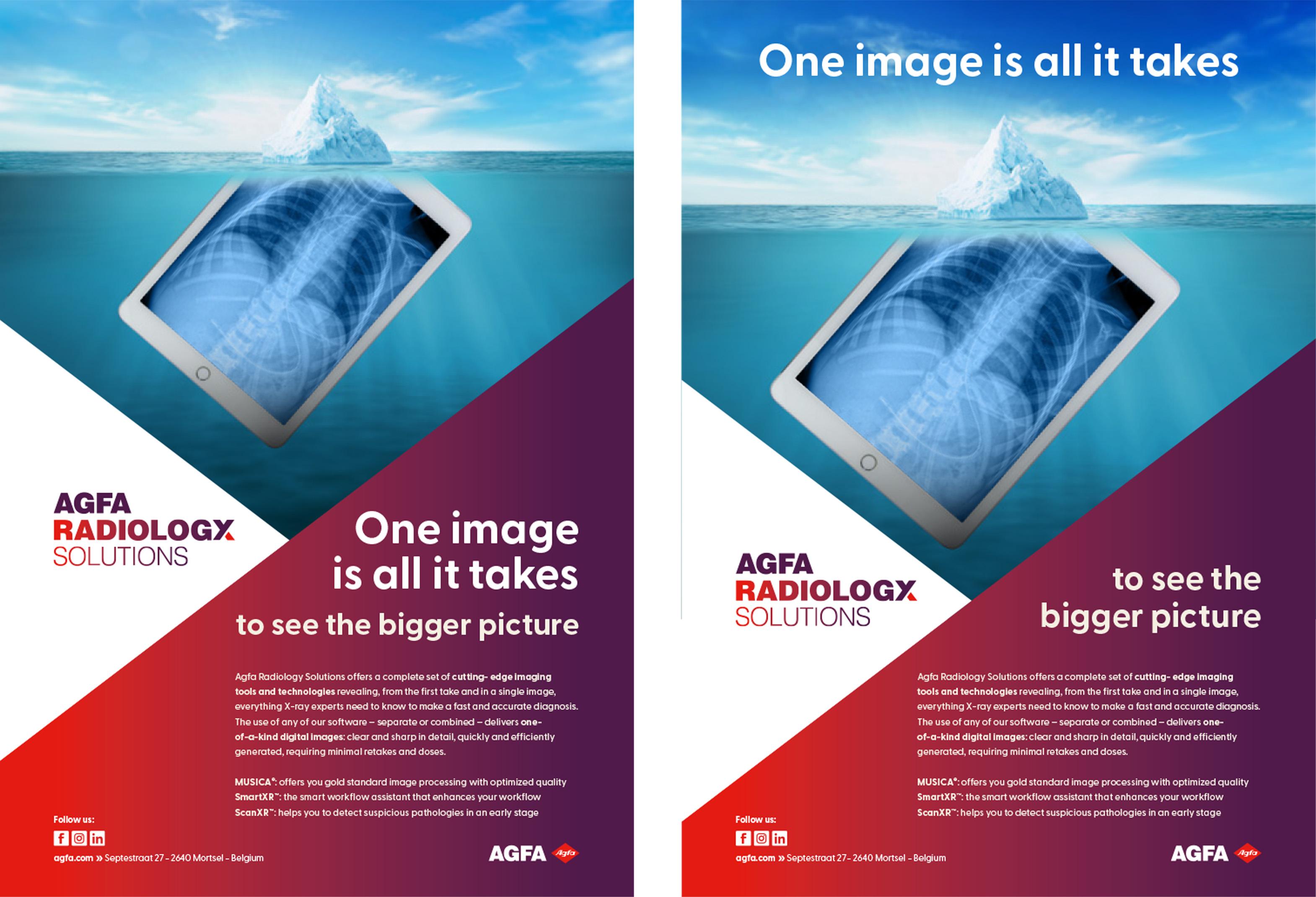
In our communication strategy, the baseline is not just an optional add-on, but an integral part of the visual. Without it, the message remains incomplete. Therefore, the concept visual is preferred not to be used without the baseline.
When incorporating the baseline into the image, there are two distinct approaches. One option is to include the entire baseline together below, in the graphical element. Alternatively, there is the possibility of dividing the baseline, placing the first part on the image and the second part below in the graphical element. This approach allows for greater flexibility in design.
Typeface
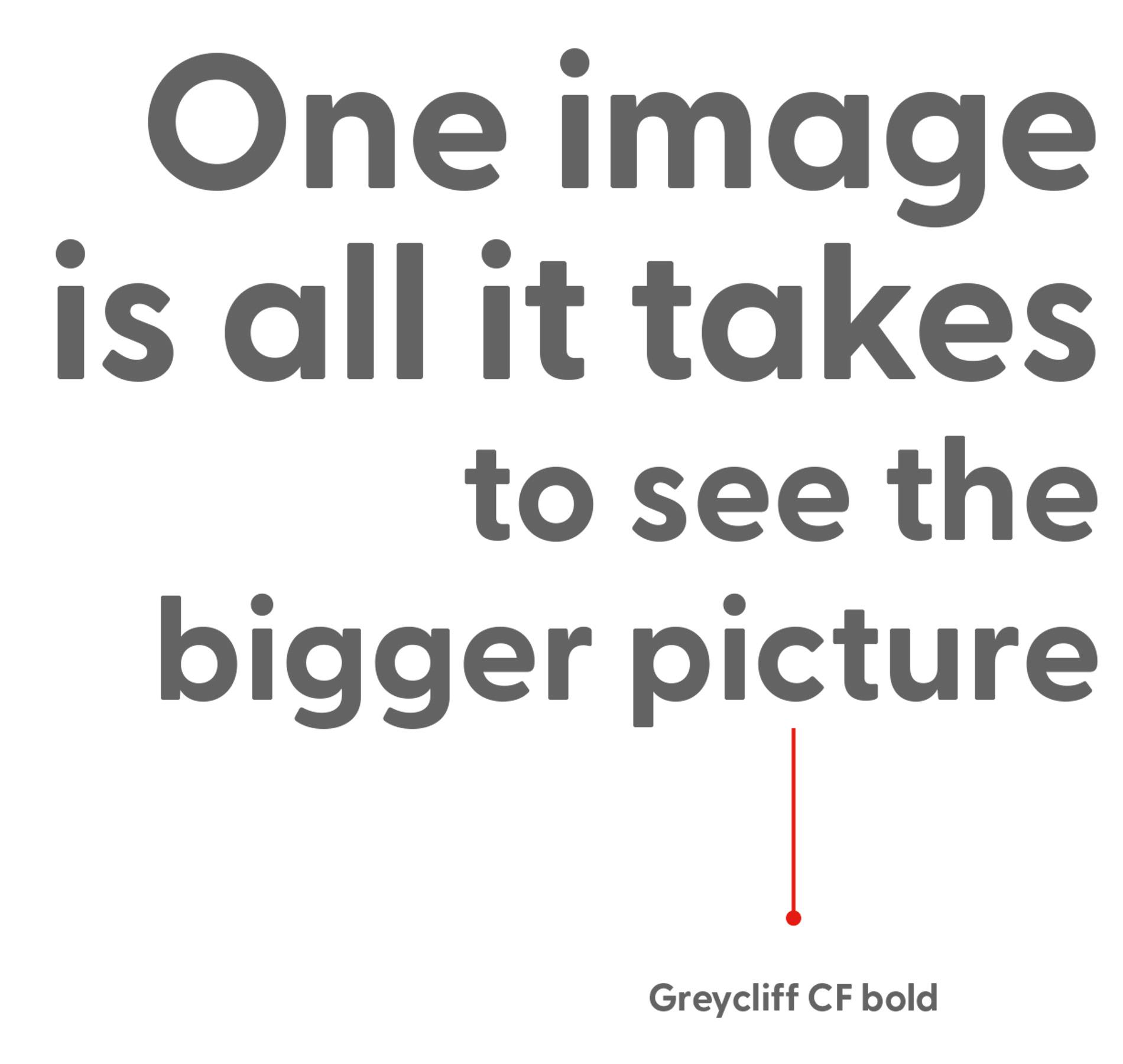
For the baseline we use the Greycliff CF bold font to ensure clarity, impact, and consistency across our branding materials.
When it comes to our baseline, we employ a deliberate visual hierarchy. The first part of the baseline, One image is all it takes, is always displayed in a larger size compared to the second part. This intentional design choice emphasizes the primary message while still maintaining coherence with the overall visual composition.
The logo
In combination with the image
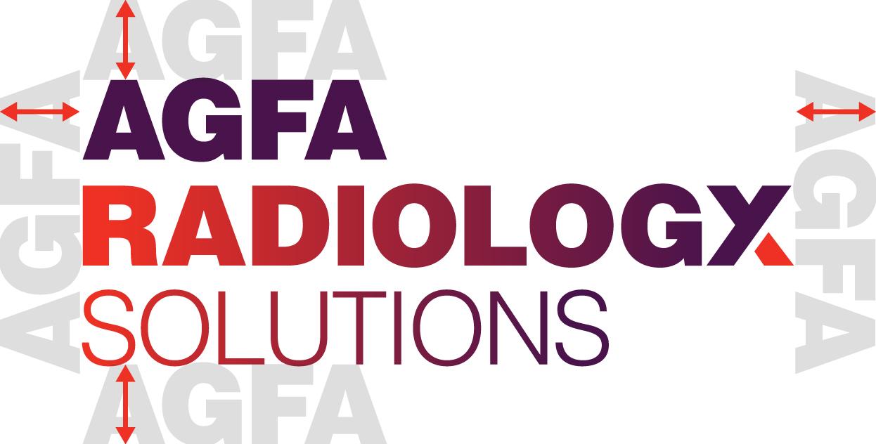
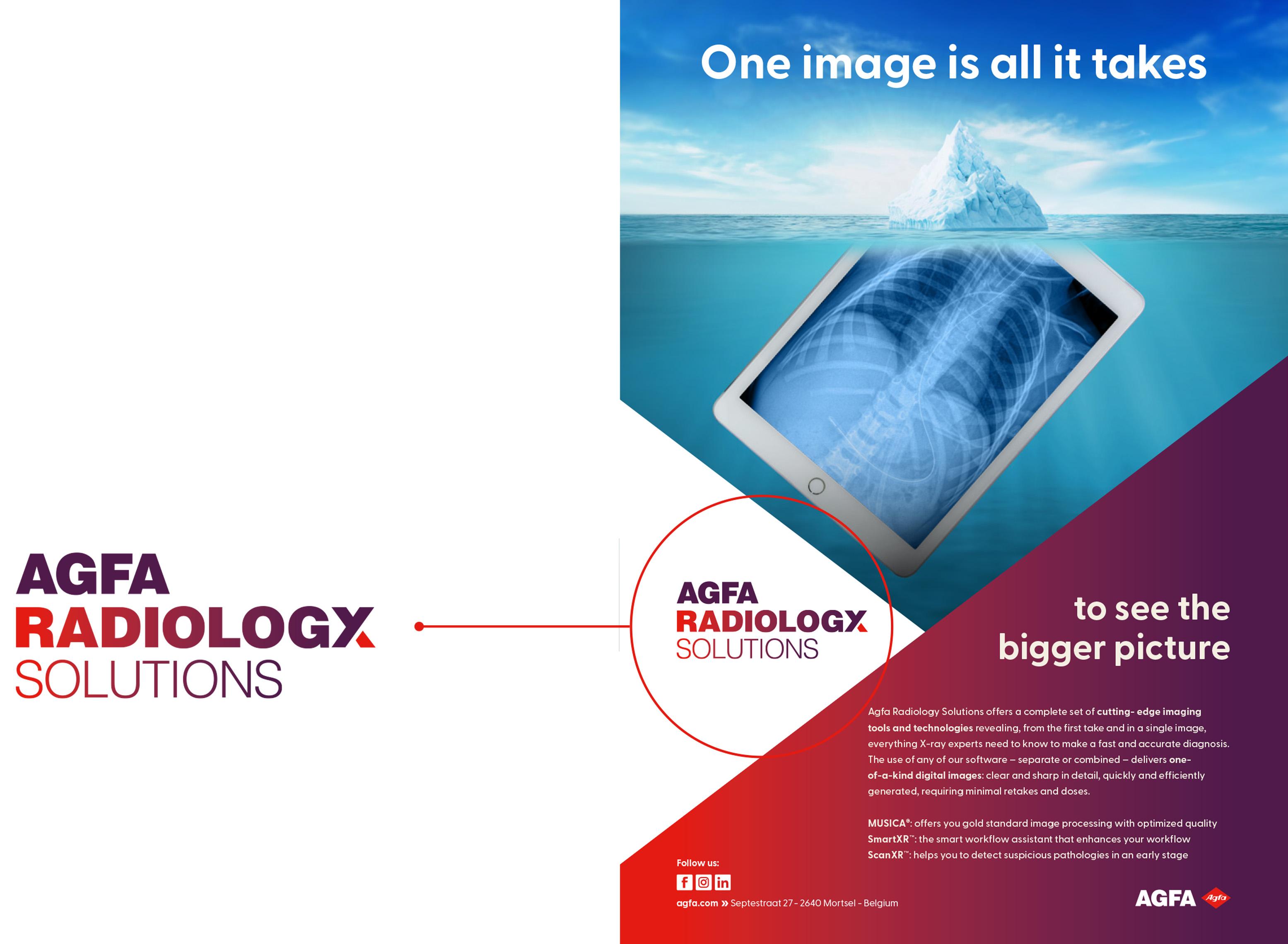
There are two types of logos that can be used: the color version and the white version. While the preferred choice is the color version, there are instances where the colored triangle sections of the Agfa branding cannot be used. In such cases, when the logo is placed directly on the image, the white version must be used to ensure sufficient contrast.
Free space: Please give the Agfa Radiology Solutions logo some space to breathe. The height of the capital ‘A’ in ‘AGFA’ is the strict minimum free space on all sides of the logo. Give the logo more space whenever you can.

Design templates
Available templates

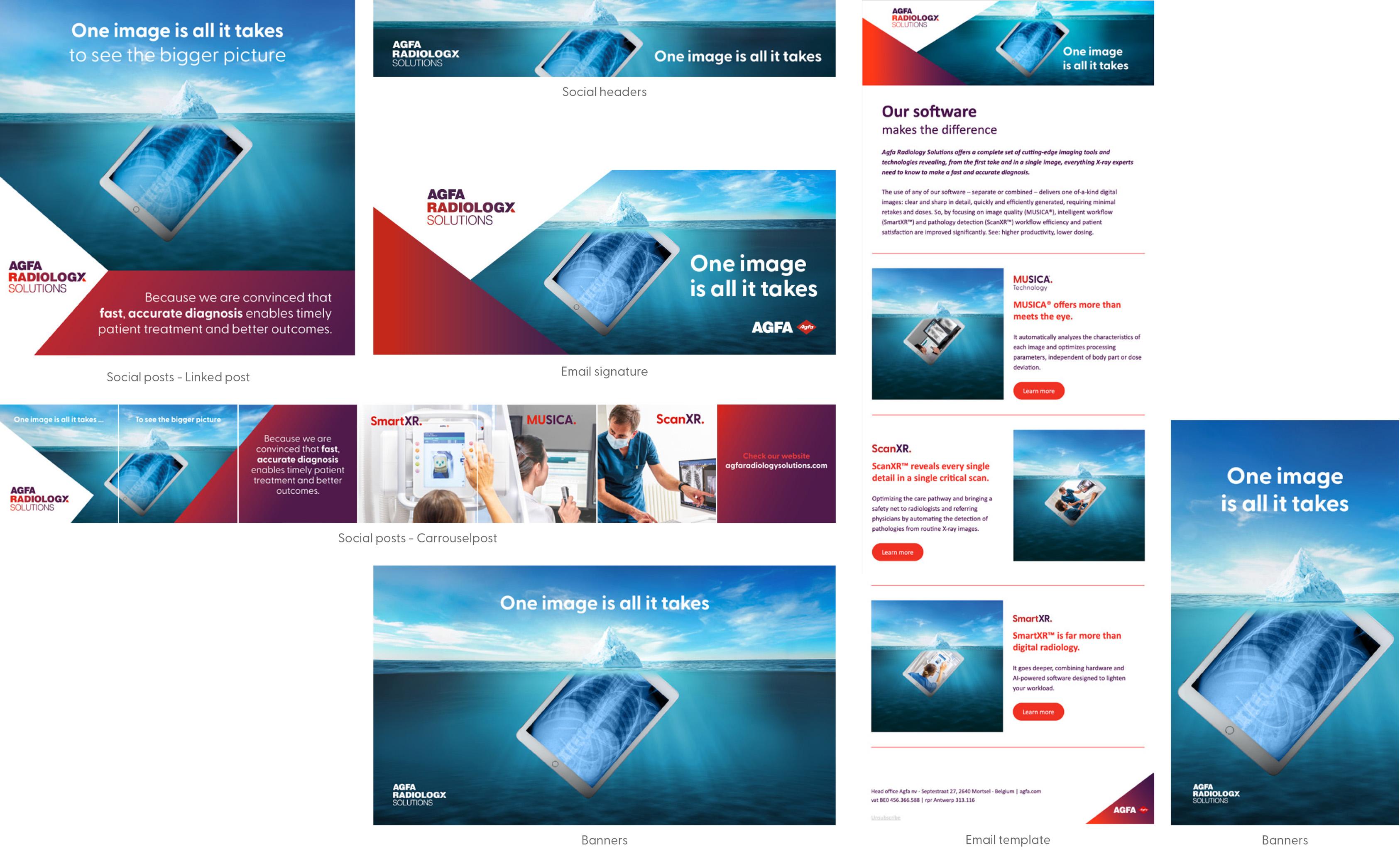
There are various design templates available that simplify layout creation and ensure consistency with all applicable rules and styles:
• A4 ad templates
• Social banners
• Base images with alpha layer
• Open file for tablet content adjustment (print + video)
• Email template
• Email signature
• Intro/outro video
• PPT
• Social post examples
Using these templates ensures that all your materials adhere to the same design standards and visual identity.
Agfa Radiology Solutions

