The logo
Standard version
The Agfa Radiology Solutions logo is set in the typeface of the original Agfa logo. This way, it visually builds on the rich Agfa heritage.
The stand-out element in the logo is the ‘Y’ in ‘Radiology’, that doubles as the ‘X’ for ‘x-rays’.
In its standard form, ‘Agfa’ is in dark violet, while ‘Radiology’ and ‘Solutions’ are coloured in a specific gradient from red pigment to dark violet. The small polygon that turns the ‘Y’ into an ‘X’ is in red pigment.
Alternative versions
The logo with the gradient is the default version. It should be used wherever it’s possible.
If faithfully reproducing the gradient is not possible for technical reasons, the alternative version without the gradient should be used. In this version, ‘Radiology’ and ‘Solutions’ are in Red Pigment, while ‘Agfa’ and the small polygon that turns the ‘Y’ into an ‘X’ are in Dark Violet.
In the rare cases where using colours is not possible, the alternative version in black and grey should be used.
If the logo is to be used on a coloured background, the white version of the logo should be used. In this version of the logo, ‘Radiology’ and ‘Solutions’ are in solid white, while ‘Agfa’ and the small polygon that turns the ‘Y’ into an ‘X’ are in white with an opacity of 65%.

The actual colour in which ‘Agfa’ and the small polygon appear, depends on the background on which the logo sits. As both ‘Agfa’ and the small polygon are in white with an opacity of 65%, the background will remain visible in both elements with an opacity of 35%.

The same version of the logo should be used on black or greyscale backgrounds in the rare cases where using colours is not possible. ‘Radiology’ and ‘Solutions’ are in solid white, while ‘Agfa’ and the small polygon are in white with an opacity of 65%.

Landscape version

You should always use the regular version of the logo, where the three words are stacked. Only on special occasions, when there is simply not enough space, can you substitute the regular logo for the landscape version. A branded ballpoint, where you only have some width but very little heigth, is a good example.
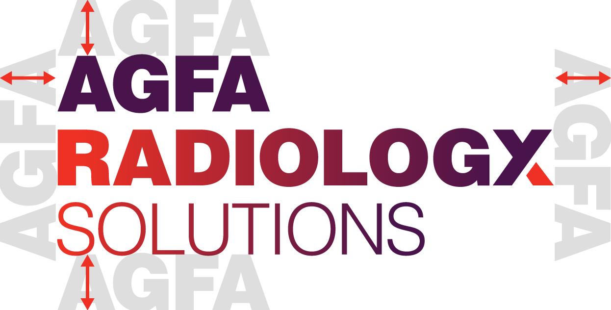
Free space
Please give the Agfa Radiology Solutions logo some space to breathe. The height of the capital ‘A’ in ‘AGFA’ is the strict minimum free space on all sides of the logo. Give the logo more space whenever you can.
Avoiding mistakes
The Agfa Radiology Solutions logo is a valuable asset for our company and a key element in our visual identity. Please use it with respect and do not alter its appearance in any way.
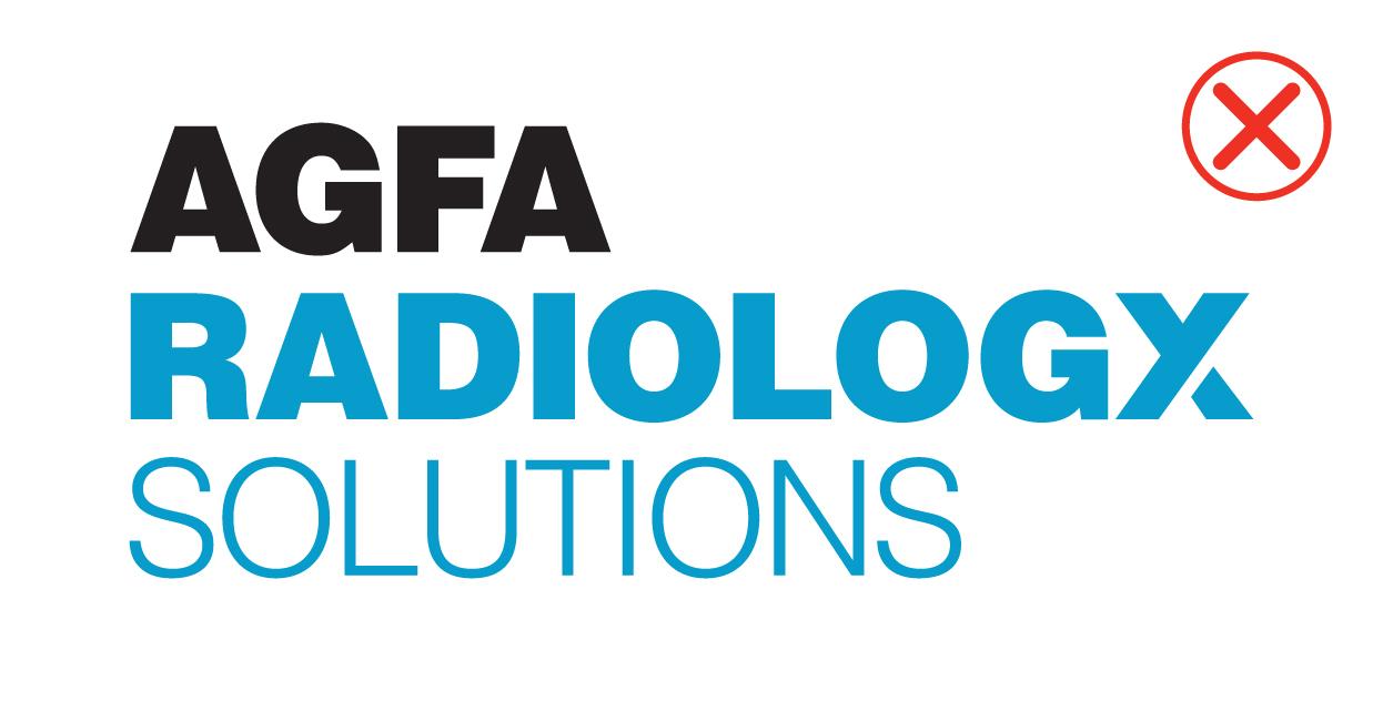
Don’t alter the colours of the logo.
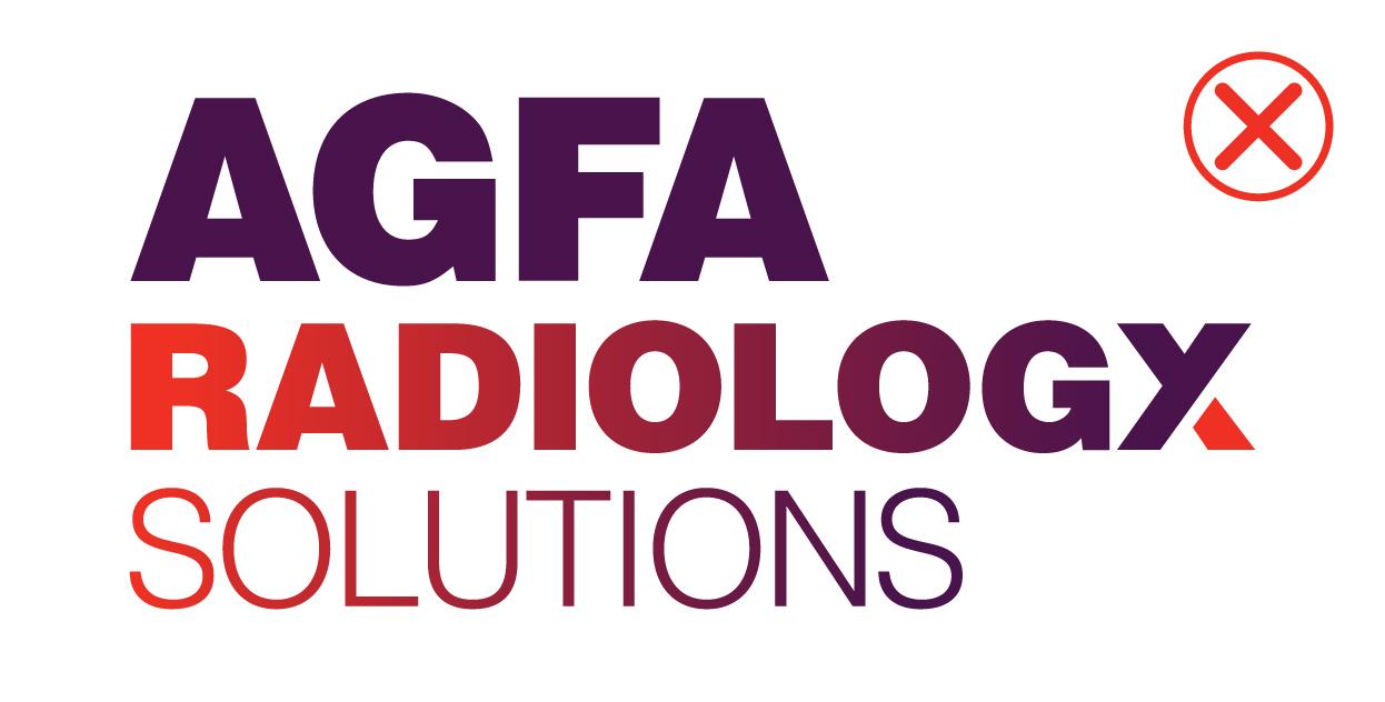
Don’t change the relative size of an element of the logo.

Don’t put the logo on a bizzy background.
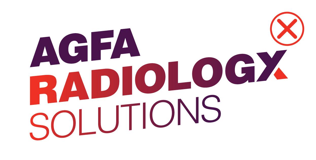
Don’t rotate or skew the logo.
Don’t give the logo a drop shadow or some other effect.
The baseline
How and when to use it

Our baseline is Empowering X-ray Experts. We use it on the back cover of our brochures and other publications. Use it sparingly, preferably only on back covers, to avoid clutter.

The baseline is not a seperate element that you can use wherever you see fit. If it is used, it should always appear with the logo, at a distance from the logo that equals the heigth of the ‘A’ in ‘AGFA’.
The ‘X’
Favicon and graphic element
The ‘Y’ and the polygon that turns it into an ‘X’ are used as a favicon that refers to the logo. The favicon represents Agfa Radiology Solutions on social media. It should always be accompanied by the stacked logo underneath. The favicon is available in two versions: coloured on a white background and white with a transparent polygon on a coloured background.
The ‘X’ sits on a white background. The ‘Y’ is coloured in a specific gradient from Dark Violet to Red Pigment, while the polygon is in Red Pigment. It should always be accompanied by the stacked logo underneath.
If the ‘X’ is used on a large scale (like on a poster or a large display), the stacked logo underneath becomes too large and the visual balance is lost. In those cases, you should always use the alternative version of the ‘X’ with the landscape version of the logo underneath.
For larger-than-life use
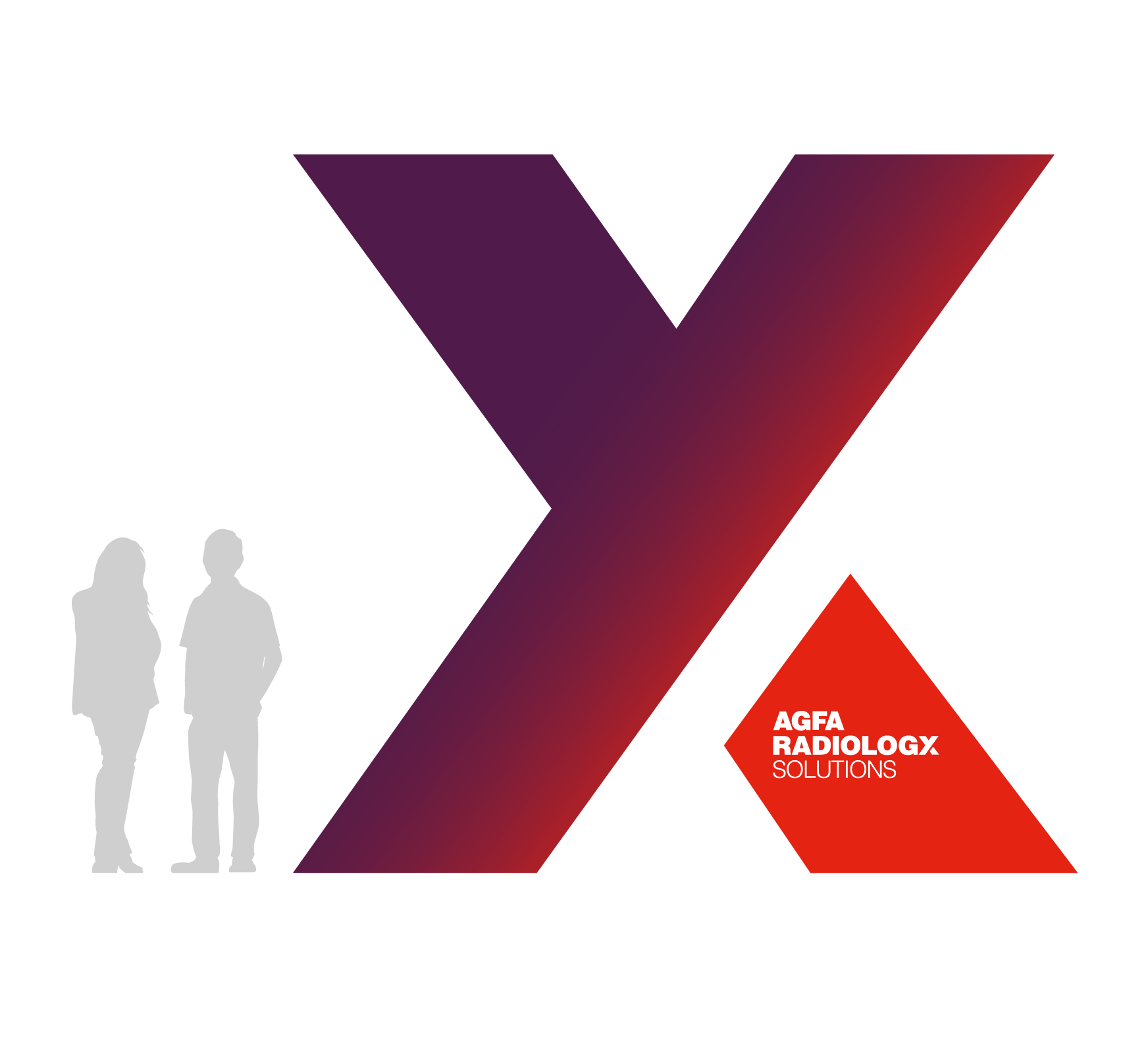

The ‘X’ can be used in a larger-than-life size in exhibition stands and on inside or outside walls, like in the example shown above. For larger-than-life use, the large-scale ‘X’ comes with the stacked logo in the polygon. This is an exceptional application of the ‘X’ that should be used when the ‘X’ is huge – and only then. Please contact the marketing department if you need this special version of the ‘X’.
The Agfa logo
Colour use on backgrounds
The original Agfa logo continues to be used on some occasions, as a secondary logo that complements the Agfa Radiology Solutions logo.
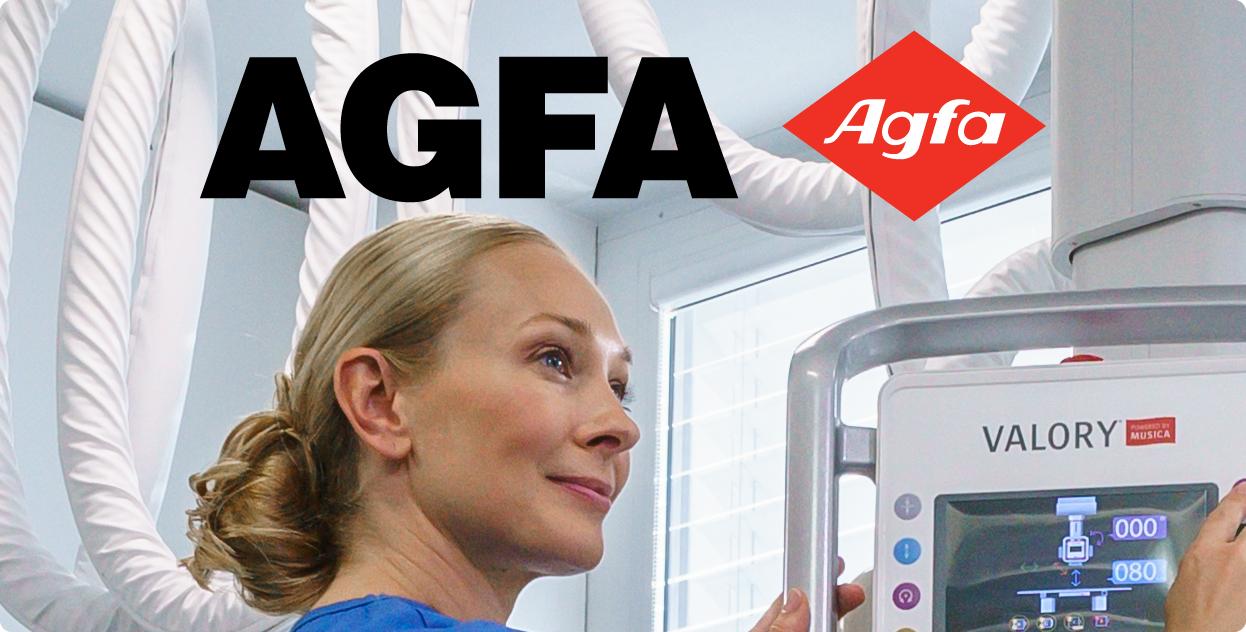
On a white or light background, ‘AGFA’ is black and the rombus is in Red Pigment. On a medium to dark background, ‘AGFA’ should be white, while the rombus remains in Red Pigment.
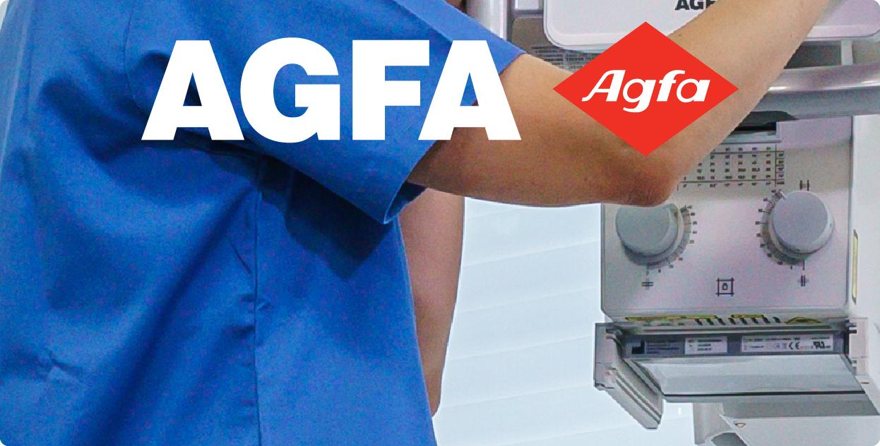
When combined with the Agfa Radiology Solutions logo
In some cases, the original Agfa logo appears alongside the Agfa Radiology Solutions logo, on the same page or in the same visual space. In that case, the size of ‘AGFA’ in the Agfa logo is at 70% of the size of ‘AGFA’ in the Agfa Radiology Solutions logo.
When both logos are combined, the Agfa Radiology Solutions logo should appear on the left side, while the Agfa logo should always be in the bottom right corner.

Agfa Radiology Solutions

