See through to the future campaign
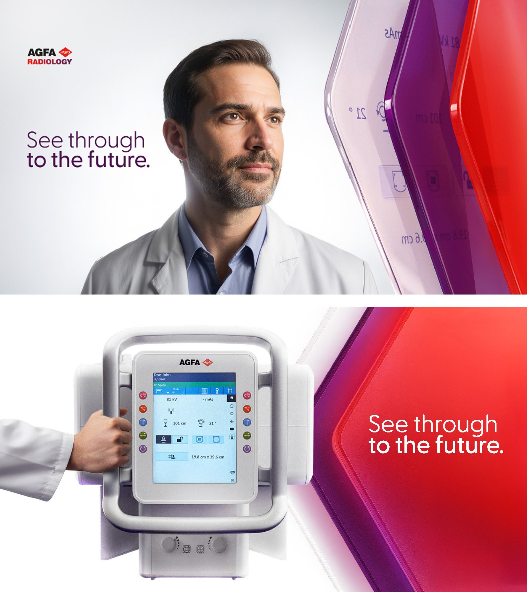
The concept image
Explanation

The concept image represents the act of “seeing through” as both a visual and strategic metaphor. It reflects radiology professionals looking beyond what is immediately visible to access deeper insight and make confident decisions.
The hero visual typically shows an X-ray expert in a moment of focus and responsibility, positioned beside or within transparent overlapping layers. These layers evoke both traditional imaging surfaces and modern digital interfaces, reinforcing the transition from legacy to intelligent, workflow-driven solutions.
The concept image embodies the campaign’s core message: Agfa enables experts to see beyond the image—through complexity, through pressure, and through uncertainty—toward clarity and future readiness.
It is not a futuristic aesthetic. It is a present, clinical reality expressed through transparency, depth, and focus.
The baseline
Explanation
The baseline “See through to the future” is the campaign’s central statement and verbal signature. It expresses Agfa’s ability to deliver clarity and confidence today while intentionally shaping what comes next.
It carries two meanings:
- Deep vision: Seeing beyond the image into the data, intelligence, and context that support better decisions.
- Future alignment: Not observing the future from afar but being continuously aligned with radiology’s rhythm as it evolves. The baseline communicates that Agfa is not simply reacting to change. It is actively building progress—while ensuring performance and reliability where it matters today.
Use of the baseline
The baseline should be used as a consistent signature across all campaign materials. It should appear as a clear and recognizable element that unifies global communication.
Best practices for the usage:
- Place it near the hero visual or as a standalone statement on clean backgrounds
- Use it as a closing signature on longer communication pieces
- Use it as a headline when a short and impactful message is needed
- Always provide sufficient space around it, reinforcing clarity and confidence
Typeface
For the baseline we use the Greycliff CF.
'See through' = Greycliff CF Light
'to the future' = Greycliff CF Medium
The “See through to the future” tagline is a valuable asset for our company and a key element in our Branding Campaign. Please use it with respect and do not alter its appearance in any way.

Avoiding mistakes
Do not change the tagline colour. Always use the approved colour applications only.

Do not alter the tagline proportions or layout. The tagline must always keep its original balance and composition.

Do not rebreak or rearrange the tagline. Never change the approved line break or text structure.

Typography
Greycliff
Our main typeface is Greycliff. It is clear and friendly, with a range of weights from Light to Extra Bold. In most cases, two or three weights are enough within the same document. The Thin, Extra Light and Heavy versions should be used only in exceptional cases.

Colours
Dark Violet and Red Pigment are the two primary colours in our corporate identity. They are present in the logo and can be applied to various graphic elements. For tagline applications, the preferred colours are Dark Violet or white.

Dark Violet
Pantone 262
C 58 M 92 Y 12 K 54
R 73 G 19 B 76
#49134C
RAL 4007
NCS S5040R40B

Red Pigment
Pantone 485
C 0 M 95 Y 100 K 0
R 238 G 49 B 36
#EE3124
RAL 3020
NCS S1085Y80R

White
Pantone White
C 0 M 0 Y 0 K 0
R 255 G 255 B 255
#FFFFFF
Concept behind the layers
The layers must communicate:
1. Years of imaging experience
2. The development of new technologies focused on empowering X-ray experts
3. A window to the future that addresses pressing healthcare challenges through innovation, while ensuring current solutions remain future-ready
RED LAYER

Legacy & Expertise
The red layer represents Agfa Radiology Solutions’ heritage in imaging—its history, experience, and deep expertise built over decades, originating from the iconic red X-ray film.
This layer anchors the brand in credibility and trust, showing that Agfa’s future-facing innovation is built on a proven legacy. It is the foundation that ensures the brand remains grounded in real clinical relevance.
Key meaning
Proven expertise. Trusted performance. Credibility over time.
Message behind the layer
Agfa’s innovation is not built on speculation. It is built on decades of imaging excellence.
PURPLE LAYER

Transition & Digital Evolution
The purple layer represents Agfa’s transition from its heritage to a digitally driven future. It reflects the evolution of advanced technologies developed to meet the changing demands of the healthcare sector.
It also draws from purple’s strong association with the clinical environment, symbolizing expertise, trust, and medical relevance. This layer expresses Agfa’s transformation into a solutions-oriented partner—focused on intelligent workflows, efficiency, and integration.
Key meaning
Evolution. Clinical relevance. Intelligent progress.
Message behind the layer
Agfa is actively evolving, translating trusted expertise into digital performance and new operational value.
WHITE LAYER

Clarity & Future-Building
The white layer represents clarity and the future being built in real time. It symbolizes intelligent software, efficient workflows, and seamless integration—highlighting Agfa’s focused investment in solutions that bring efficiency and confidence to radiology environments.
This layer communicates that Agfa is not only building what comes next, but ensuring that today’s systems are designed to remain relevant and future-ready.
Key meaning
Clarity. Integration. Future-ready workflows.
Message behind the layer
The future is not distant. It becomes operational through clarity, intelligence, and continuous workflow improvement.
How the layers work together
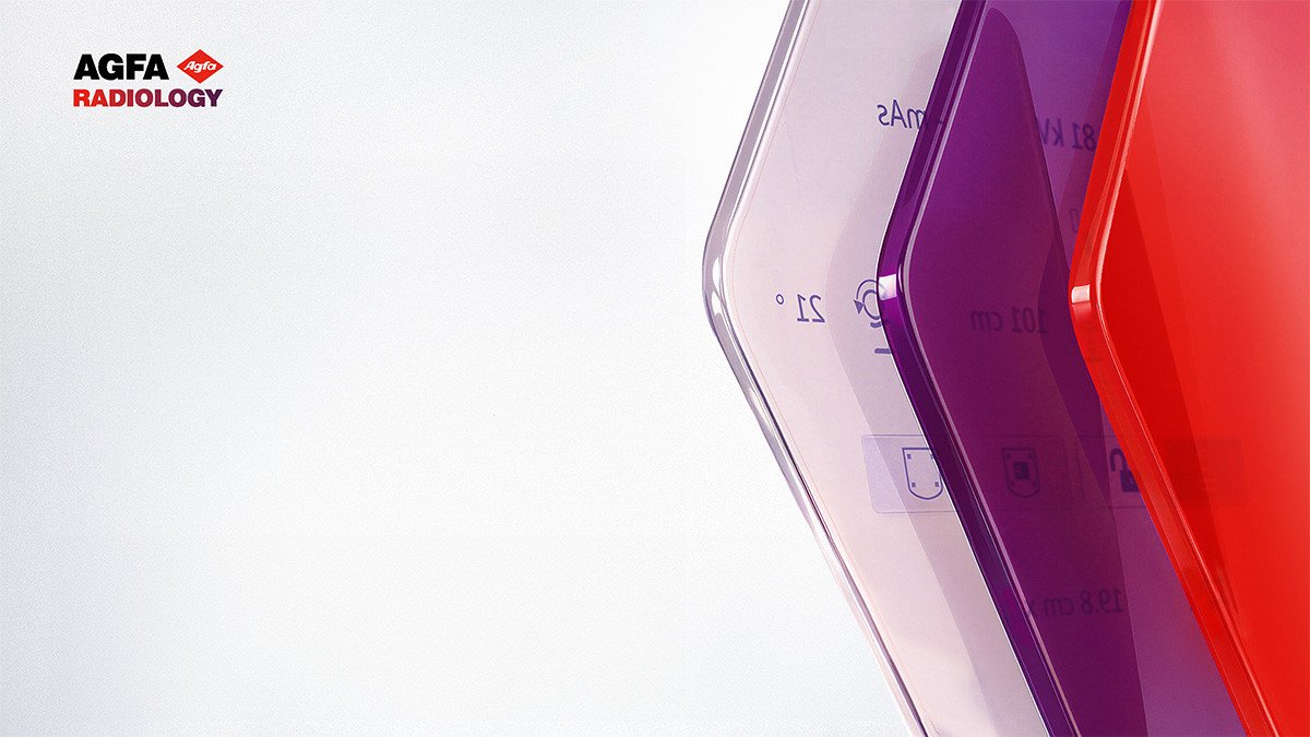
The layered system expresses Agfa’s strategic direction through a visual metaphor: each layer reveals part of the story, and together they create a clear window into the future.
Red: establishes credibility through legacy and imaging expertise.
Purple: represents transformation and digital evolution grounded in clinical relevance.
White: reveals the future as clarity, intelligence, workflow efficiency, and seamless integration.
Activation principles
How the campaign should come to life

Campaign launch and brand moments
Use strong, minimal statements and hero visuals that reinforce the window/layer metaphor.
Product communication
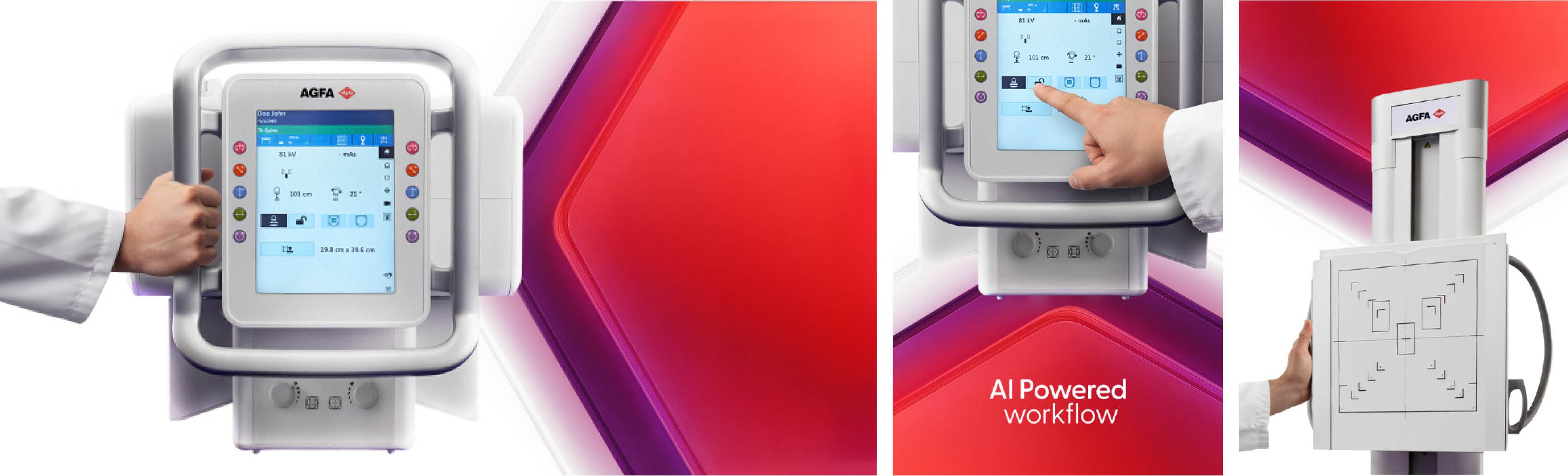
Prioritize workflow value, integration, and expert benefit over feature lists.
Internal communication
Use the campaign to unify teams globally around a shared direction, highlighting reliability and future readiness.
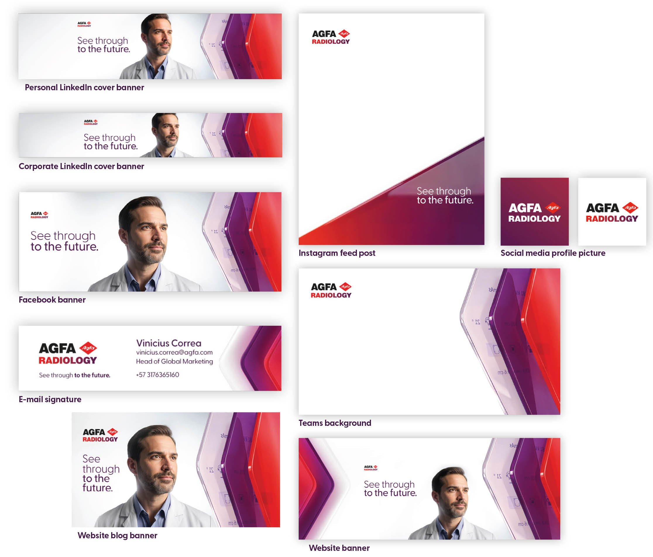
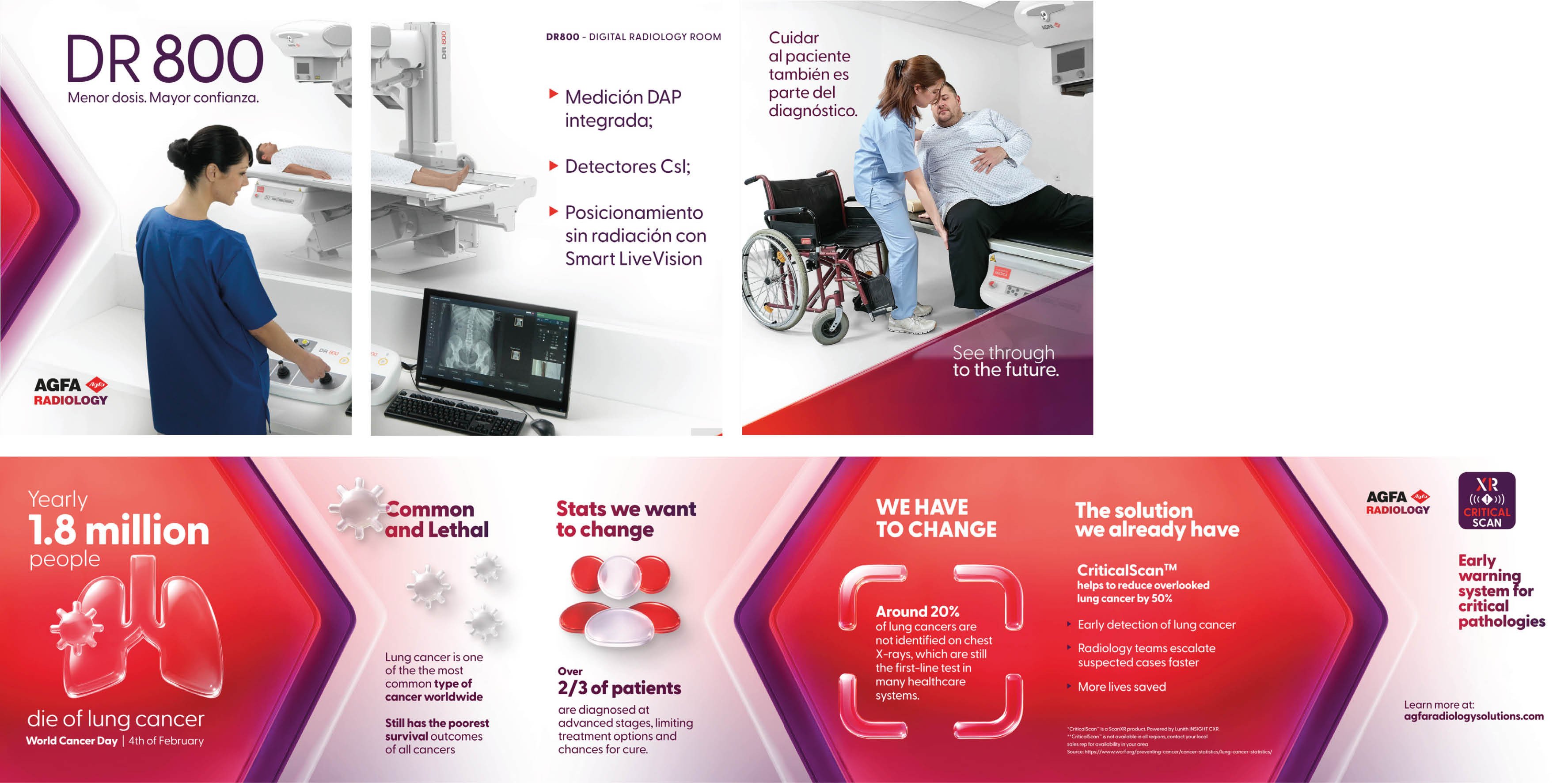
Digital and paid media
Keep headlines short. Use strong contrast and minimal copy.
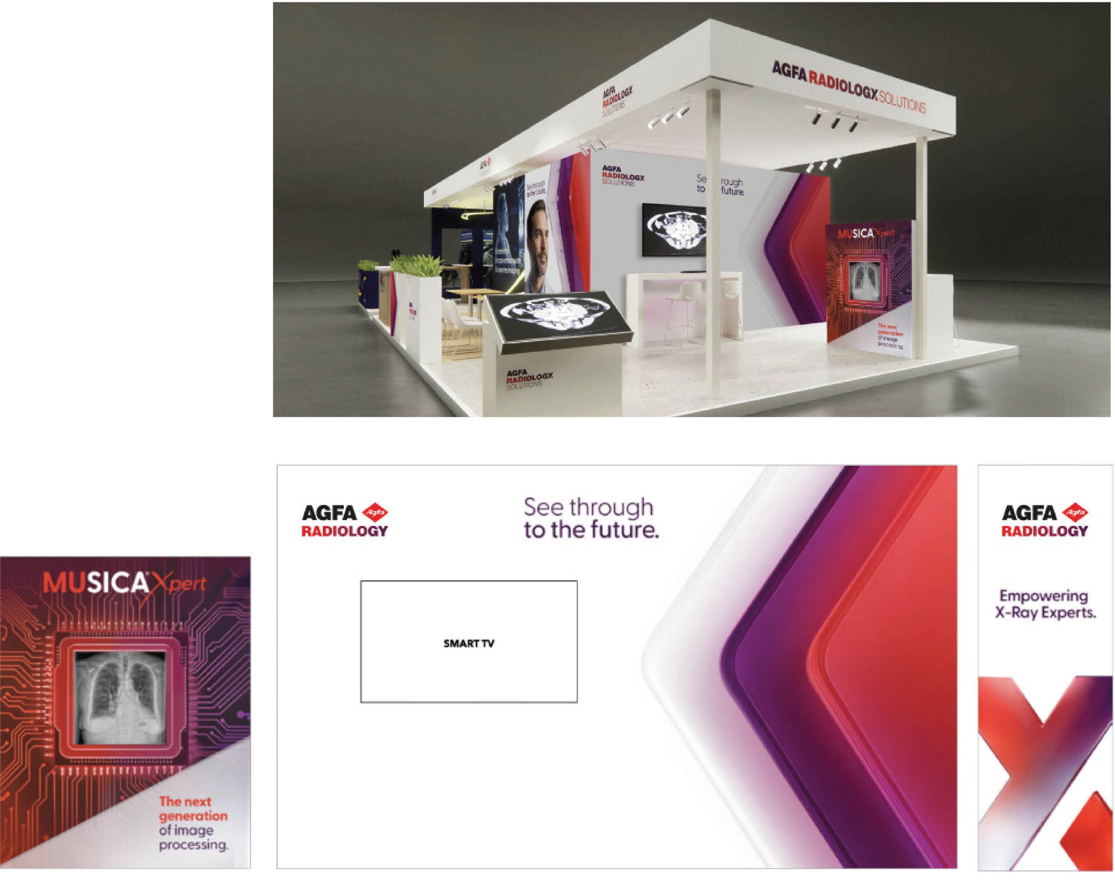
Events
Keep headlines short. Use strong contrast and minimal copy.
Promotional Materials

Gifts, everyday objects, and branded merchandise should reflect the idea of “seeing through.”
Whenever possible, use translucent materials and layered elements to reinforce the campaign’s visual language, as illustrated in the examples.